Under a gold standard prices drifted down for decades at a time and nobody treated it as a crisis, because that is what rising productivity does to costs when the unit of account holds still. The unit stopped holding still in 1913, and every crisis since has ratcheted the money supply and the debt permanently higher. These charts are what that break did to prices, to the federal budget, and to the cost of capital itself.
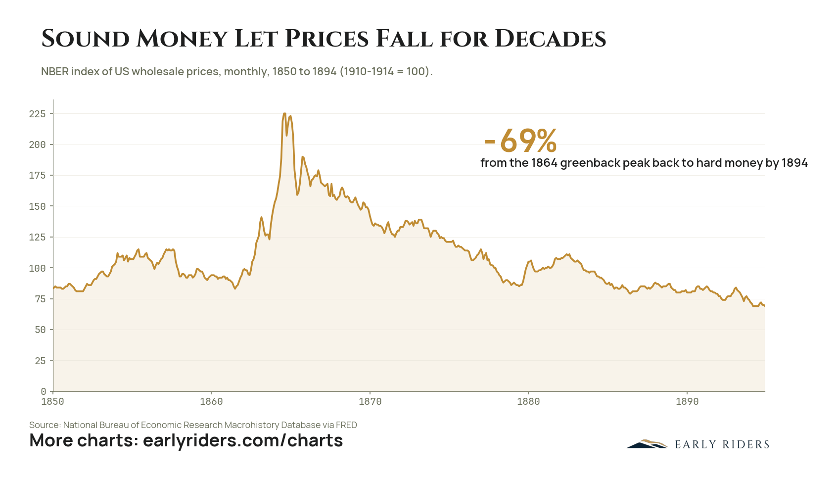
US wholesale prices fell 69 percent between the 1864 greenback peak and 1894 as the country returned to hard money, a three-decade deflation that ran alongside rapid industrial growth.
Between 1850 and 1894 the United States ran an experiment in monetary regimes and left a clean record of the result. The NBER wholesale price index, benchmarked so that 1910 to 1914 equals 100, opened the period near 83 and moved in a band roughly between 80 and 115 through the 1850s. War finance broke that pattern. Once the Union began issuing unbacked greenbacks, the index more than doubled, peaking at 225 in 1864. The three decades that followed reversed all of it and more. As the country worked its way back to a hard money standard, wholesale prices fell 69 percent from the greenback peak, closing 1894 at 69, below where the series began in 1850. The decline was gradual and interrupted, with a partial recovery into the early 1880s that gave way to further softness. It also ran alongside one of the most rapid industrial expansions in American history. That combination is the point. Falling prices did not prevent capital formation or growth, which undercuts the standard argument that a monetary system permitting deflation is unworkable. For anyone holding a fixed-supply asset today, this is the closest historical analogue available. A savings instrument that gains purchasing power over decades is not a theoretical construct. The United States lived under one for a generation, and the burden of proof belongs to the side arguing it cannot happen again.
When did the US last experience decades of falling prices?
US wholesale prices fell 69 percent from their 1864 greenback peak to 1894, according to the NBER Macrohistory index via FRED. The index peaked at 225 in 1864 and ended 1894 at 69, below its 1850 starting level near 83. The decline accompanied America's return to hard money and its industrial expansion.
Chart data: NBER index of US wholesale prices, monthly, 1850 to 1894 (1910-1914 = 100).
Period
1850 to 1894
Plotted
Wholesale price index
Source
National Bureau of Economic Research Macrohistory Database via FRED
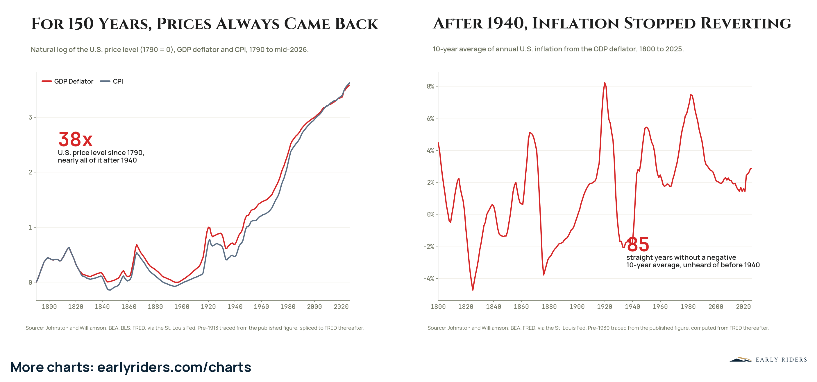
The US price level is 38 times its 1790 level with nearly all of the increase arriving after 1940, the same break after which ten-year average inflation stopped ever going negative.
The left panel plots the natural log of the US price level from 1790, using both the GDP deflator and CPI, and the two series tell the same story: prices are 38 times their 1790 level, and nearly all of that increase arrived after 1940. Before then the price level moved in both directions. Wars pushed it up around 1814, during the 1860s, and again around 1919, and each spike was followed by a decline that gave back most of the ground. By 1940 the price level stood only modestly above where it started 150 years earlier. The right panel measures the break directly. Ten-year average inflation from the GDP deflator swung between roughly negative 6 percent in the 1820s and nearly 8 percent around 1920. Since 1940 it has not gone negative once, an 85-year run with no precedent in the prior 140 years. It reads 2.9 percent today. Values before 1913 on the left and before 1939 on the right are traced from published Johnston and Williamson figures and spliced to FRED data thereafter, so read the early path as accurate in shape rather than to the decimal. The practical consequence is that holding cash stopped being a round trip. Under the old regime, waiting out an inflation spike worked because the reversal came. Under the current one, only the rate is ever in question, never the direction.
How much has the US price level risen since 1790?
The US price level is 38 times its 1790 level, with nearly all of that increase arriving after 1940. Before 1940, inflation reverted: ten-year average inflation went negative repeatedly, reaching roughly negative 6 percent in the 1820s. Since then there have been 85 straight years without a negative ten-year average.
Chart data: Natural log of the U.S. price level (1790 = 0), GDP deflator and CPI, 1790 to mid-2026.
Period
1790 to mid-2026 (left panel); 1800 to 2025 (right panel)
Plotted
Left panel: GDP Deflator, CPI. Right panel: GDP Deflator (10-year average inflation)
Source
Johnston and Williamson; BEA; BLS; FRED, via the St. Louis Fed. Pre-1913 traced from the published figure, spliced to FRED thereafter.
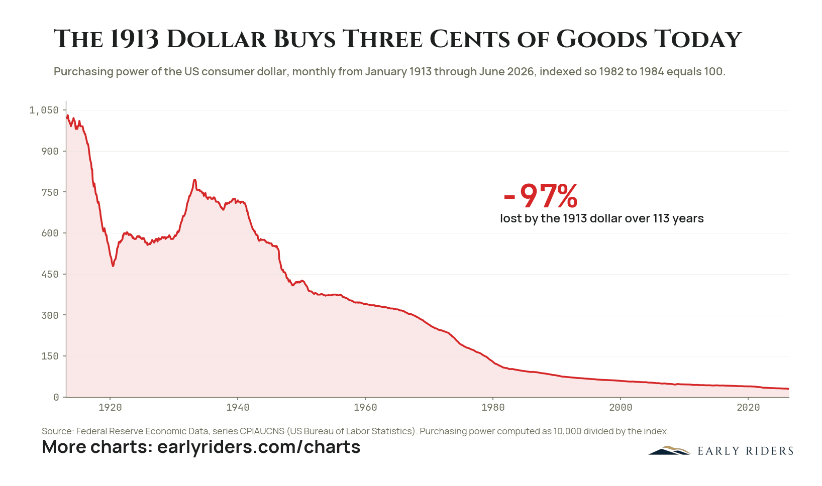
A dollar held since 1913 has lost 97% of its purchasing power, leaving it able to buy about three cents of the goods it once bought.
The Bureau of Labor Statistics tracks what a consumer dollar actually buys. Indexed to January 1913 at 1,020.4, that measure stood at 29.9 in June 2026. The decline is 97.07%, which leaves the 1913 dollar with 2.93 cents of its original purchasing power after 113 years.
The path is not a smooth slope, and the interruptions are instructive. The First World War cut the dollar nearly in half, to 481 by June 1920. It recovered through the 1920s to about 590, then gained again during the Depression, peaking at 800 in May 1933 as prices collapsed. That was the last time holders of cash were meaningfully rewarded. Wartime and postwar inflation took the measure down to about 445 by the late 1940s, the 1950s and 1960s ground lower in steady steps, the 1970s fell steeply, and since 1983 the index has spent every month below 100.
The useful reading is not that inflation is high in any given year. It is that the unit most savings are denominated in has depreciated in almost every decade for over a century, and the two periods when it did not were a world war aftermath and a depression.
Holding wealth in that unit is a position, not a neutral resting state.
How much purchasing power has the US dollar lost since 1913?
The US consumer dollar has lost 97.07% of its purchasing power between January 1913 and June 2026, falling from an index level of 1,020.4 to 29.9. A 1913 dollar now buys about 2.93 cents worth of goods, based on Bureau of Labor Statistics data published through FRED.
Chart data: Purchasing power of the US consumer dollar, monthly from January 1913 through June 2026, indexed so 1982 to 1984 equals 100.
Period
January 1913 through June 2026
Source
Federal Reserve Economic Data, series CPIAUCNS (US Bureau of Labor Statistics). Purchasing power computed as 10,000 divided by the index.
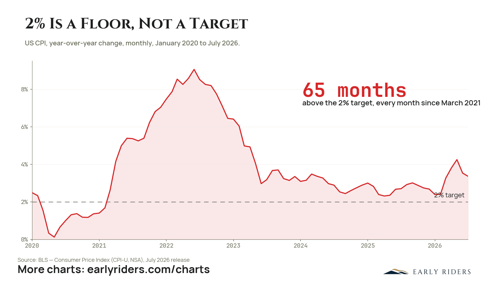
CPI has printed above the 2% target every month since March 2021, 65 straight months, and the latest reading is 3.4%.
The Federal Reserve describes 2% as a symmetric target, meaning misses above and below should balance out over time. The record since the pandemic reads differently. CPI crossed above 2% in March 2021, peaked at 9.1% in June 2022, and has not printed below the target since: 65 consecutive months, averaging about 4.5% over the stretch. The July 2026 reading of 3.4% arrived after a reacceleration through the spring, which makes it hard to describe the latest stretch as the tail end of a smooth descent. A miss that persists for more than five years and averages more than double the target is better understood as a revealed policy preference. Debt of the size the US now carries is easier to service in a currency that gives up 3 to 4% of its purchasing power every year. For anyone holding savings in that currency, the floor at 2% is the advertised loss rate, and the last five years show the realized rate runs well above it.
How long has US CPI been above the Fed's 2% target?
Every month since March 2021, 65 consecutive months through July 2026, averaging about 4.5% over the stretch. CPI peaked at 9.1% in June 2022 and the July 2026 print was 3.4%.
Chart data: US CPI, year-over-year change, monthly, January 2020 to July 2026, with the 2% target marked.
Period
January 2020 to July 2026
Plotted
US Consumer Price Index (CPI-U, NSA), year-over-year % change, with the 2% target as a reference line
Source
BLS, Consumer Price Index (CPI-U, NSA), July 2026 release
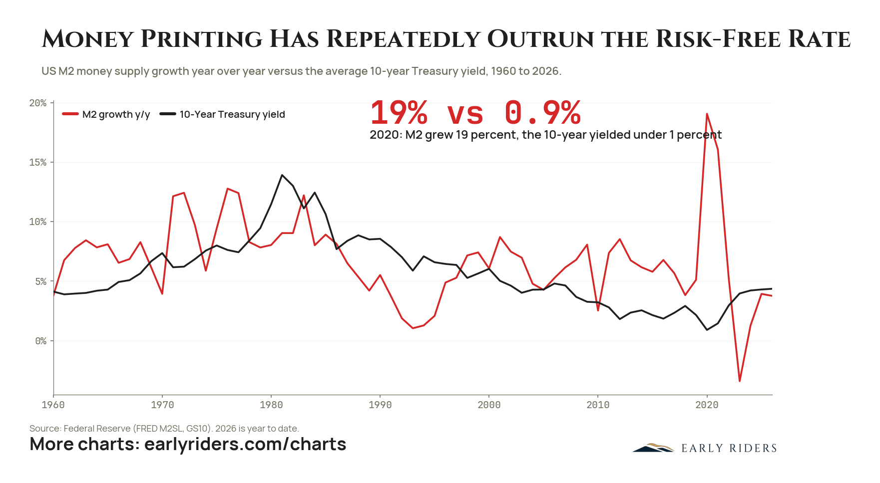
US money supply growth has run ahead of the 10-year Treasury yield through most of the past six decades, most starkly in 2020 when M2 grew 19% while the 10-year paid under 1%.
Since 1960 the growth rate of US M2 has spent most of its time above the 10-year Treasury yield. The extreme reading came in 2020, when the money supply expanded 19% while the 10-year yielded under 1%, a gap of more than 18 points. It is not an isolated episode. M2 growth ran above the yield through most of the 1960s and early 1970s, again in the 1990s and 2000s, and again from 2019 onward. The clearest exception is the early 1980s, when the 10-year reached about 14% and the yield sat above money growth for most of a decade. Since 2023 the two have converged near 4% to 5%, with 2026 shown year to date. Both series come from the Federal Reserve, M2SL and GS10. The point for anyone holding capital is that the nominal risk-free rate has rarely been a hurdle worth clearing. If the unit of account is expanding faster than the safest instrument pays, then holding Treasuries preserves the number and not the claim on real assets. That reframes what counts as a conservative position. The default cash allocation has been quietly losing ground for most of living memory, and the 2020 reading was the most expensive version of that trade rather than a new phenomenon.
Has US money supply growth outpaced Treasury yields?
Yes, for most of the period from 1960 to 2026. The starkest gap came in 2020, when US M2 grew 19% year over year while the 10-year Treasury yielded under 1%. The main exception was the early 1980s, when the 10-year reached about 14%.
Chart data: US M2 money supply growth year over year versus the average 10-year Treasury yield, 1960 to 2026.
Period
1960 to 2026
Plotted
M2 growth y/y, 10-Year Treasury yield
Source
Federal Reserve (FRED M2SL, GS10). 2026 is year to date.
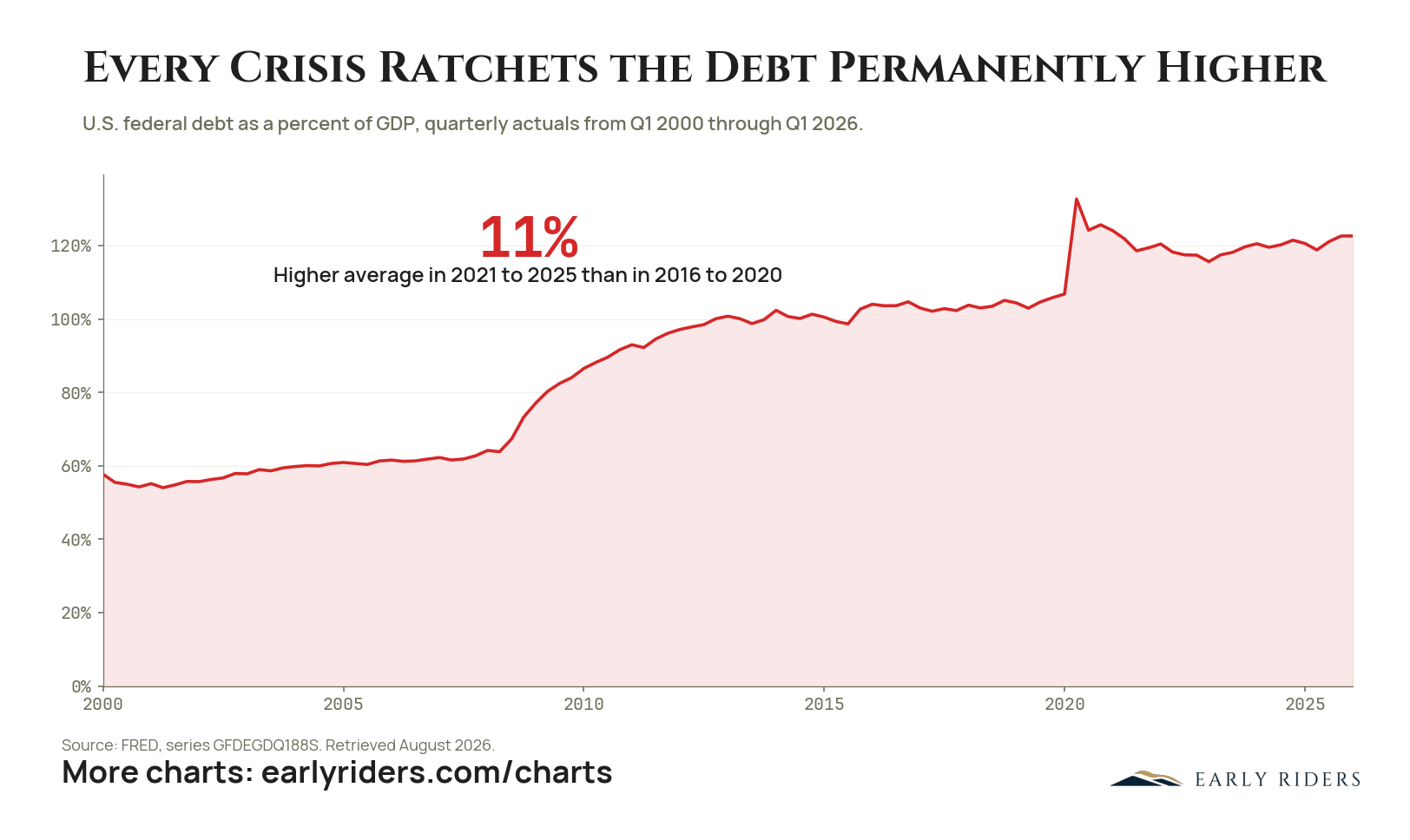
US federal debt has gone from about 57% of GDP in 2000 to 122.6% in early 2026, stepping up at each crisis and never coming back down.
Federal debt stood near 57% of GDP in the first quarter of 2000 and drifted up to roughly 64% by 2008. The financial crisis moved it to about 100% within five years, where it plateaued for most of the 2010s. The 2020 shutdown pushed it to a peak of 132.7%. It has since eased to 122.6% as of the first quarter of 2026, still more than 20 points above the pre-2020 plateau and more than double the level of 2000. The 2021 to 2025 average sits 11% above the 2016 to 2020 average. Data is FRED series GFDEGDQ188S, retrieved August 2026. The shape is the argument. Debt does not oscillate around a mean here. It steps up at each emergency and settles at a new, permanently higher floor, because the spending enacted during a crisis rarely reverses and the borrowing is never retired. Two shocks 12 years apart moved the ratio by roughly 65 points in total. Nothing in the record suggests the next shock behaves differently. For someone holding or deploying capital, the question is not whether the debt gets repaid in nominal terms, since it will. The question is what the currency it is repaid in will be worth, and the ratchet in this chart is the reason to hold assets that cannot be issued.
What is the US federal debt to GDP ratio?
122.6% as of the first quarter of 2026, down from a 132.7% peak in 2020 but more than double the 57% level of 2000. The 2021 to 2025 average ran 11% above the 2016 to 2020 average. Source: FRED series GFDEGDQ188S, retrieved August 2026.
Chart data: U.S. federal debt as a percent of GDP, quarterly actuals from Q1 2000 through Q1 2026.
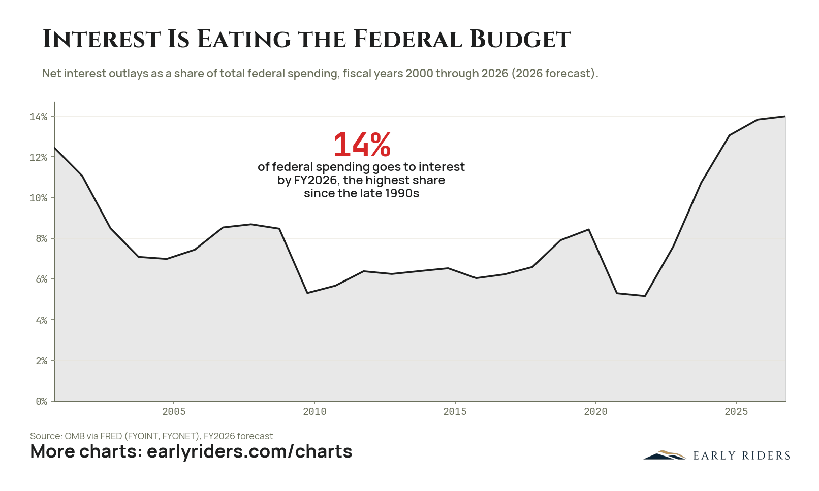
Net interest is forecast to consume 14% of all US federal spending in fiscal 2026, the highest share since the late 1990s.
Net interest took about 12.4% of federal outlays in fiscal 2000, then fell for a decade as rates declined, bottoming near 5.3% in 2010. It sat in a 6% to 6.5% band through the middle 2010s, rose to about 8.4% in 2020, and dropped again to roughly 5.2% in 2021 as emergency spending swelled the denominator and rates sat at zero. From there it has gone straight up, reaching a forecast 14% in fiscal 2026. The FY2026 figure is a forecast, not an actual. Data is from OMB via FRED. Interest is the one line in the budget nobody votes on. It is set by the size of the debt and the level of rates, and it is paid before anything else. At 14%, roughly one dollar in seven of federal spending buys no service, no transfer, and no investment. Every increment it takes has to come from somewhere: higher taxes, lower discretionary spending, or more borrowing at the prevailing rate. Historically the path of least political resistance has been to let nominal growth and inflation shrink the real value of the obligation. Anyone holding long-duration nominal claims on the US government is on the wrong side of that preference, and the pressure behind it strengthens with every year the interest share climbs.
What share of US federal spending goes to interest payments?
About 14% of total federal outlays in fiscal 2026, a forecast figure and the highest share since the late 1990s. That is up from roughly 5.2% in 2021 and 8.4% in 2020. Net interest last approached this level in fiscal 2000, near 12.4%. Source: OMB via FRED.
Chart data: Net interest outlays as a share of total federal spending, fiscal years 2000 through 2026 (2026 forecast).
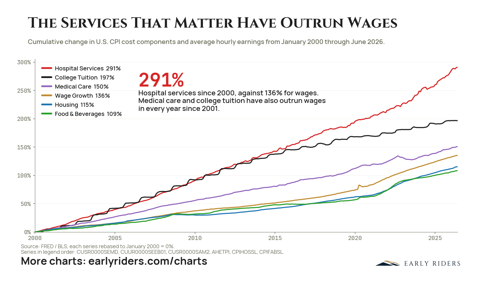
Hospital services, college tuition, and medical care have each risen faster than American wages every year since 2001, taking a growing share of household income.
From January 2000 through June 2026, hospital services rose 291%, college tuition 197%, and medical care 150%. Average hourly earnings rose 136% over the same period. Housing rose 115% and food and beverages 109%, both below wages. The three categories that outran pay are the three a household can least easily avoid, postpone, or substitute. Medical care and college tuition have beaten wage growth in every year since 2001, so this is not a single episode that a later stretch of real wage gains offsets. It is a 26-year trend. All series are rebased to January 2000 and drawn from FRED and Bureau of Labor Statistics data. The arithmetic is uncomfortable. A household whose pay has grown 136% while its hospital bills have grown 291% is not poorer on paper, but its discretionary income has been quietly reallocated to the least negotiable line items. Savings capacity is what gets squeezed. For capital already accumulated, the relevant measure of preservation is not the headline inflation rate but the growth rate of the specific obligations the money is meant to fund. Hospital costs have grown more than twice as fast as the pay meant to cover them. A portfolio benchmarked to headline inflation is quietly losing ground against the bills that actually come due.
Have healthcare and college costs risen faster than wages in the US?
Yes. From January 2000 through June 2026, hospital services rose 291%, college tuition 197%, and medical care 150%, against 136% for average hourly earnings. Housing rose 115% and food and beverages 109%. Medical care and tuition have outrun wages in every year since 2001. Source: FRED and BLS.
Chart data: Cumulative change in U.S. CPI cost components and average hourly earnings from January 2000 through June 2026.
Period
January 2000 through June 2026
Plotted
Hospital Services, College Tuition, Medical Care, Wage Growth, Housing, Food & Beverages
Source
FRED / BLS, each series rebased to January 2000 = 0%.
Series in legend order: CUSR0000SEMD, CUUR0000SEEB01, CUSR0000SAM2, AHETPI, CPIHOSSL, CPIFABSL.
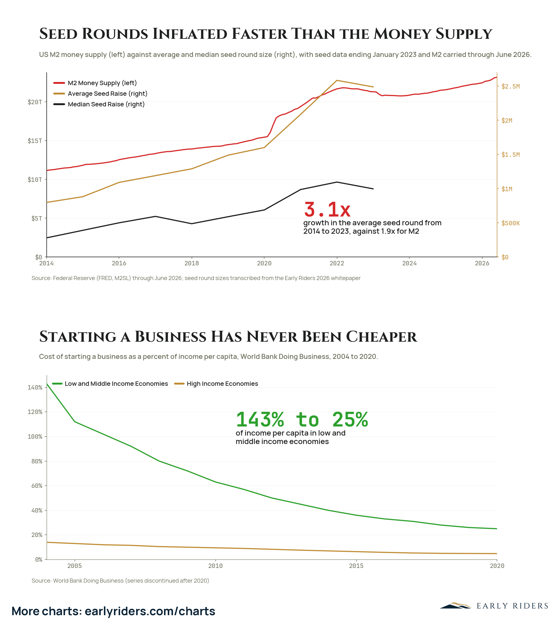
The average US seed round grew 3.1x between 2014 and 2023 against 1.9x growth in M2, even as the real cost of starting a company collapsed.
Between 2014 and 2023 the average US seed round grew 3.1x, rising from about $700,000 to roughly $2.5 million after peaking near $2.6 million in 2022. US M2 grew 1.9x over a longer stretch, from about $11 trillion in 2014 to above $20 trillion by June 2026. The median seed round traced the same arc at a lower level, moving from roughly $270,000 to about $1 million. Seed pricing, in other words, inflated faster than the money that was supposedly driving it.
The second panel explains why that is strange. World Bank Doing Business data, a series discontinued after 2020, shows the cost of starting a business in low and middle income economies falling from 143% of income per capita in 2004 to 25% by 2020, with high income economies drifting from about 14% to about 5%. The real cost of forming a company collapsed while the checks written to fund one tripled.
For anyone deploying capital into early-stage companies, that gap is the entry-price problem stated plainly. Larger rounds at lower operating cost mean more of the eventual return has to come from valuation rather than from the business clearing its first milestones, and it leaves entry price, not company quality, as the variable most likely to decide the outcome.
Have startup seed round sizes grown faster than the money supply?
The average US seed round grew 3.1x between 2014 and 2023, from about $700,000 to roughly $2.5 million, while US M2 money supply grew 1.9x. Over a similar span the cost of starting a business in low and middle income economies fell from 143% of income per capita in 2004 to 25% in 2020.
Chart data: US M2 money supply (left) against average and median seed round size (right), with seed data ending January 2023 and M2 carried through June 2026.
Period
2014 to 2026 (top panel); 2004 to 2020 (bottom panel)
Plotted
Top panel: M2 Money Supply (left), Average Seed Raise (right), Median Seed Raise (right). Bottom panel: Low and Middle Income Economies, High Income Economies
Source
Federal Reserve (FRED, M2SL) through June 2026; seed round sizes transcribed from the Early Riders 2026 whitepaper
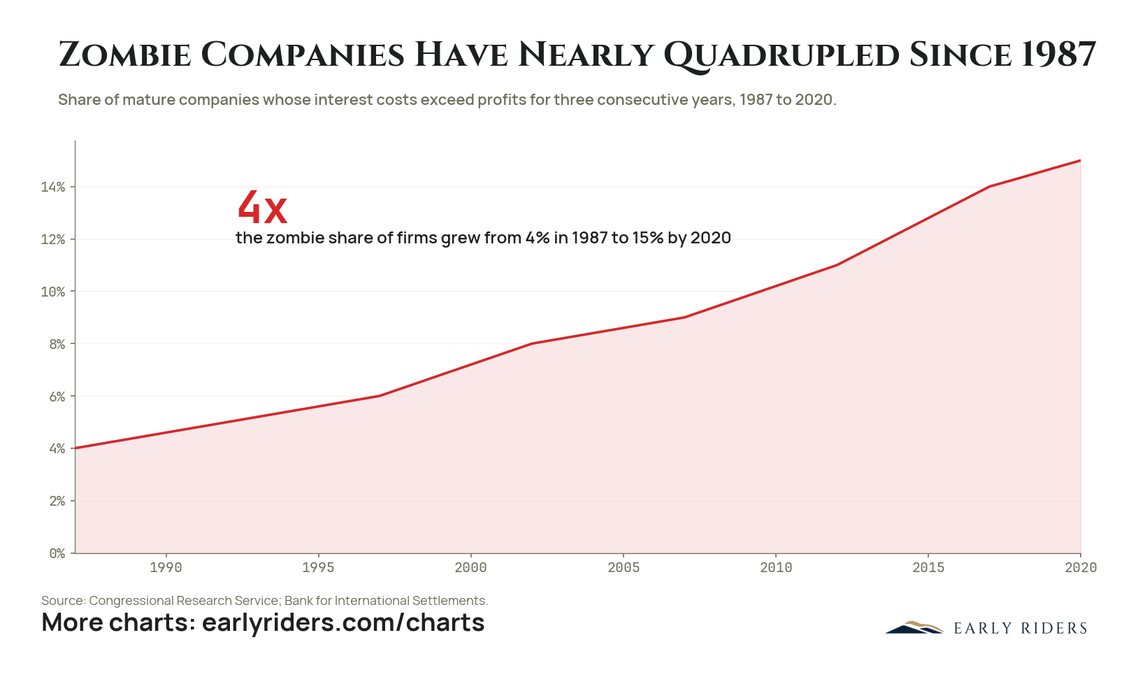
The share of mature firms whose interest costs exceed their profits for three straight years rose from 4% in 1987 to 15% in 2020.
The share of mature companies whose interest costs exceed their profits for three consecutive years rose from 4% in 1987 to 15% in 2020, according to Congressional Research Service and Bank for International Settlements data. The climb was continuous rather than crisis-driven: about 6% by 1997, 8% by 2002, 11% by 2012, and 14% by 2018. Each easing cycle left a larger residue of firms that could service debt only because money was cheap.
By 2020 roughly one mature company in seven fit that description. These are not startups burning venture money toward a milestone; they are established firms whose earnings do not cover their interest bill and have not for years.
For anyone holding broad equity or credit exposure, this is a statement about what the index actually contains. A zombie share near 15% means a meaningful slice of listed corporate America depends on refinancing conditions rather than operating performance, and that dependence only shows up when rates or credit availability move against it. The population of firms that cheap money kept alive is also the population that a sustained repricing of capital has to work through, which is a very different risk than the earnings risk most portfolios are built to absorb.
What percentage of companies are zombie companies?
The share of mature companies whose interest costs exceeded their profits for three consecutive years rose from 4% in 1987 to 15% by 2020, close to a fourfold increase, per Congressional Research Service and Bank for International Settlements data. That means roughly one mature firm in seven qualified as a zombie company by 2020.
Chart data: Share of mature companies whose interest costs exceed profits for three consecutive years, 1987 to 2020.
Period
1987 to 2020
Plotted
% Zombie Companies
Source
Congressional Research Service; Bank for International Settlements.
Get Open Range, the weekly Early Riders letter on Bitcoin, AI, and digital asset markets — a front-row seat to the singularity, delivered directly to your inbox.